Boehringer Ingelheim Revenue Dialogue Tool
How a revenue dialogue tool helped generating sales, and reducing manual repetitive work for sales reps.

Client:
Boehringer Ingelheim US (BI)
Role:
Product UX Designer
Year:
2023
The background
Boehringer Ingelheim is one of the world's leading pharmaceutical companies, developing medicines to address unmet needs in human and animal.
In an effort to enhance their sales operations, BI reached out to us after conducting comprehensive research. They were looking for a tool that would empower their sales representatives to optimise their workflows, build strong relationships with clients, and enhance their sales strategies. Previously, sales reps faced challenges due to the lack of a standardised, single source of truth for consulting their clients, which limited their sales opportunities.
Our objective was to create a solution that streamlined their processes, and ultimately drove sales effectiveness.
The team
1 x Head of Experience
1 x Product UX Designer (myself)
1 x Senior Digital Designer
2 x Developers (1 FED and 1 BED)
My responsibilities 💃
Requirement Gathering
Wireframing
Dev Handoff
The process
Stage 1 - Requirement Gathering
Discovery workshop
As the client is based in the US, we held a remote discovery workshop with the client at 4 AM Sydney time to better understand their requirements. After a two-hour session, we gained valuable insights into their needs.
Understanding the complex maths 🧮
To start, the client shared a detailed 10-tab spreadsheet including all the calculations needed for the tool. This spreadsheet was the existing 'tool' that sales reps used for client consultations during their interactions.

Tool summary 📖
Given the complexity of the tool, we decided to create a tool summary. This summary served as both a reverse brief for the client and a way for our team to ensure alignment and a shared understanding of the project
1️⃣ For whom?
Admins: Staff members responsible for managing all calculations, adjusting the backend settings, and ensuring that the tool is consistently updated with accurate calculations.
Sales Reps: Staff members acting as end-users, using the calculators to consult with clients
2️⃣ Must accept what input?
The tool must have the ability for sales reps to enter the following client information, as these factors will be critical in calculating the final recommendations:
About the client:
Client's name
Hospital name
Hospital type
Any applicable rebate schemes
About the product:
Dogs or cats products
Current pricing strategy with BI
3️⃣ Must do what?
The suggestions must include 3 categories:
Pricing Concept
Hospital Revenue
Pet Owner Savings
And tool must have the ability to:
Switch products: Ability to switch between dogs and cats products while in display mode.
Download summary in PDF: Option to download a PDF summary of the consultation.
Offline connection: Sales reps are always on the go, and many veterinarians in America often have unreliable internet connectivity. The tool must be accessible on an iPad both onlien and offline.
Stage 2 - Brainstorming the solution
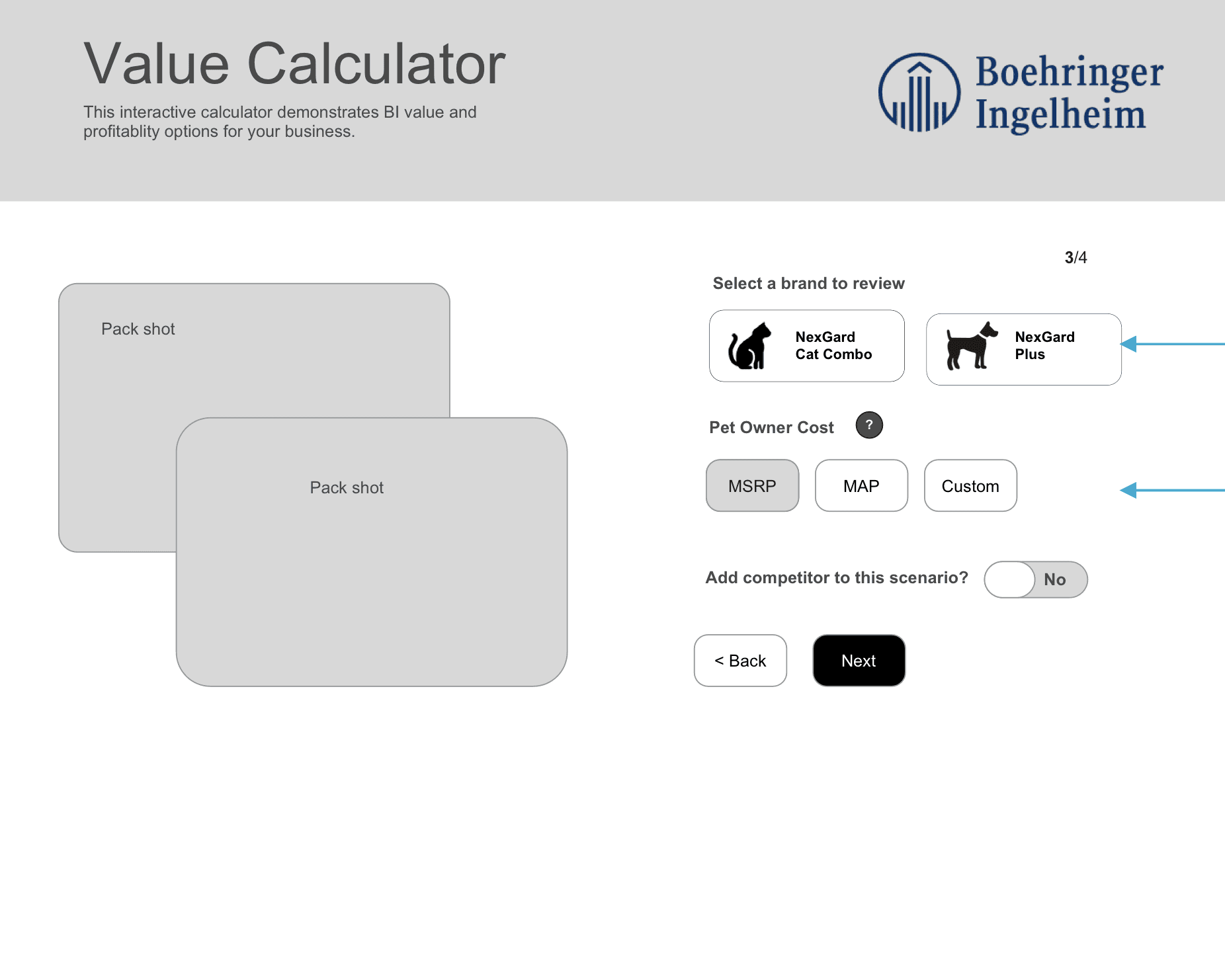
Our initial concept involved a wizard-style form to serve as the starting point for sales representatives to input client information.
Each suggestion category would then be displayed separately to prevent overwhelming users and presented in an illustrative, user-friendly manner. This design would facilitate easy navigation for sales reps, and allow veterinarians to follow the results effortlessly if they needed to review the information.
Throughout the process, the UX and development teams collaborated closely to maintain alignment on feasibility and the best technological approach. We discussed various aspects including the design of the wizard, the backend architecture, the presentation of each calculation, and the flow of results.
Below are some initial wireframes that we came up with.


We jumped on a call with over 20 sales representatives in New York, joining a call at 5 AM Sydney time to present our first draft of the tool. This session allowed us to gather feedback, ask important questions, and secure their buy-in.
By the end of the call, the sales reps expressed optimism and excitement about the tool, believing it would greatly enhance their work. It was clear that we were on the right track! 🎉
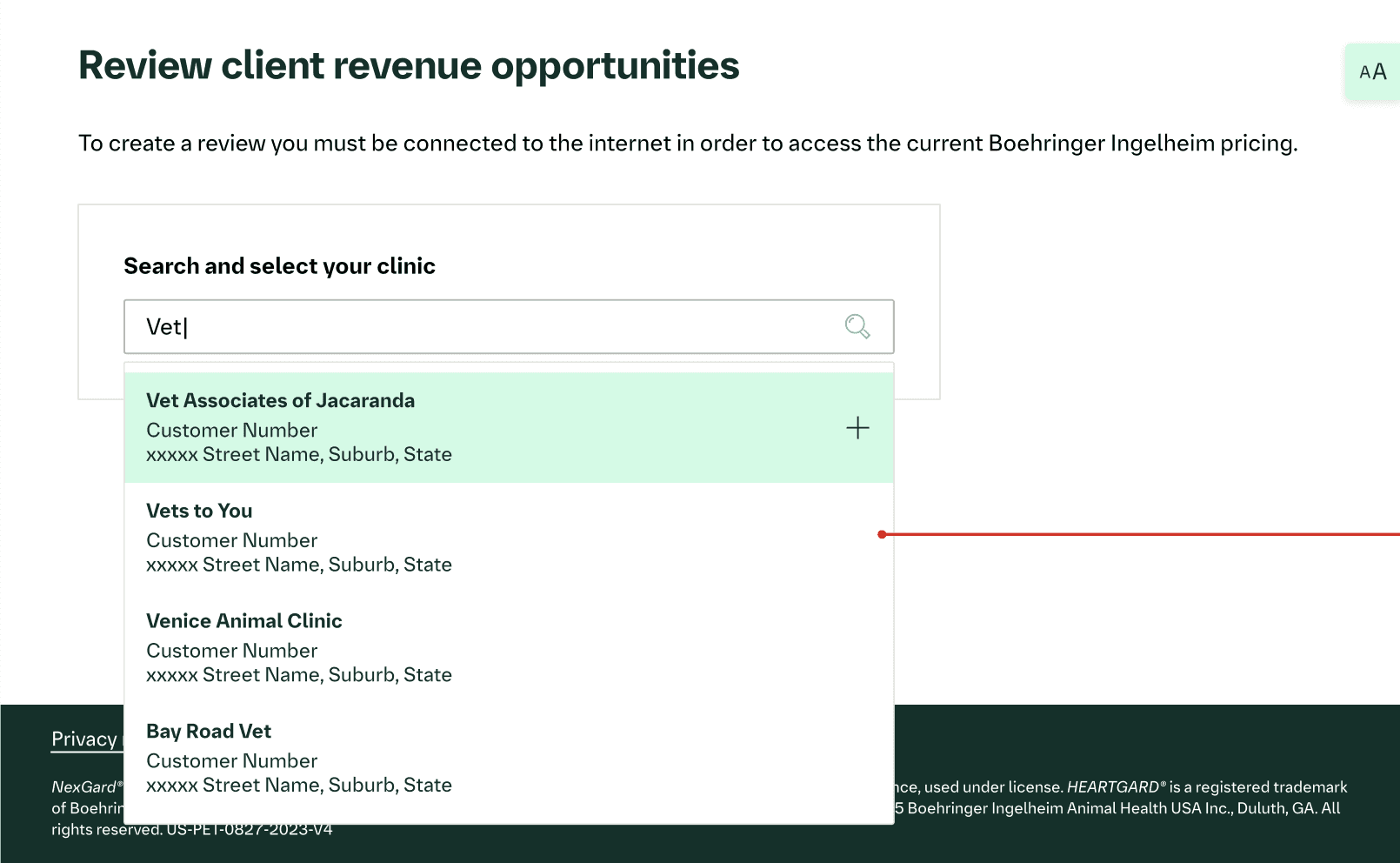
Stage 3 - UI touch-up
I worked closely with the Senior Digital Designer in this phase, making sure we're on the same page of the tool requirements and the intended look and feel. While she developed the design concept, I provided constructive feedback on the UI elements to enhance the overall user experience.
This collaboration not only allowed me to contribute to the visual UI design, but also helped me manage the whole end-to-end product creation from UX sketch to final UI.
Below are the UI screens designed off the back of the UX wireframes above.


Stage 4 - Dev Handoff
Given the complexity of the backend, we worked closely with the development team from the early stages of the project to ensure that the design and functionality were seamlessly aligned.
*Side note: With my not-so-high math ability, involving John - the BED early on was a tremendous help. He has helped me a lot in understanding the maths in the first place (thank you John!)
The feedback
We received several positive feedback from the sales reps, and on the way to phase 2 of the project to optimise the platform's automation.
